This a place where I enjoy sharing my world of discovery and creative image making. There is a wide range of subjects which you can search in "Categories"
Hi Paul – FYI – I was trying to reply to your comment on Chilliwack Valley – but I deleted you by mistake. I treasure comments, so my apologies! I’m not sure why I like that scene – nothing too exciting – but I like big trees! One day I’d like to buy a small property with a huge tree and build an awesome treehouse!
To a certain extent your perspective is spot on but I have a soft spot for monochrome and sepia images. It depends on what the theme is. Monochrome tends to work well with low light conditions and also if you are focusing on texture. Will definitely check in on your blog as I really like photography.
Thanks so much for your interest. Some of the nicest monochrome I have seen comes from https://patcallahanphotography.com/ Also, I have stopped by your home page which looks very interesting. I will soon take some time to delve into some your posts.
Thank-you! And thanks for the follow – I hope you find my short posts interesting and sometimes amusing. I will visit your site to see what you’re up to.
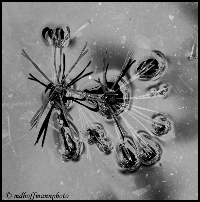
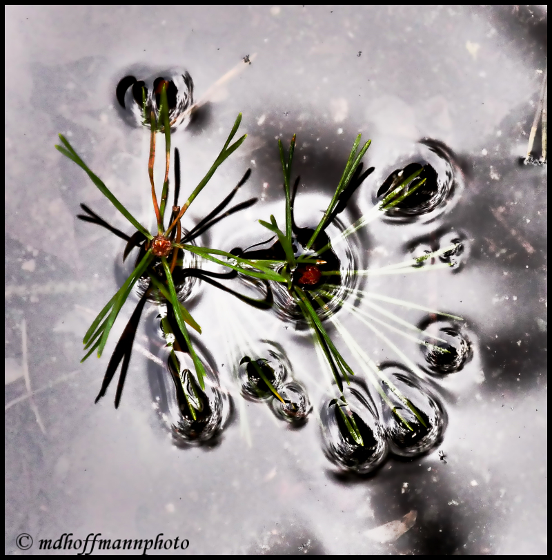

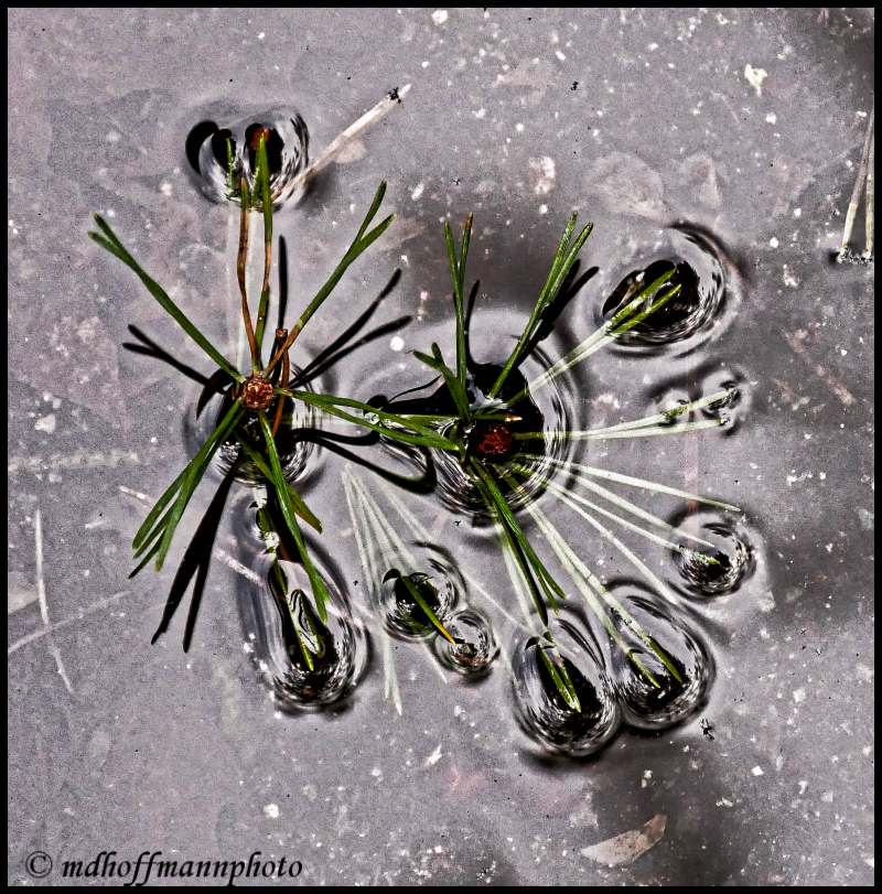


IM2. But, what matters is what you think.
LikeLiked by 1 person
Depends what I’m thinking.
LikeLike
I prefer IM5!
LikeLiked by 1 person
Ha! That is original image.
LikeLiked by 1 person
No5 🙂 like them
LikeLiked by 1 person
Thanks Paul. Seems like that’s the favourite – the original image.
LikeLiked by 1 person
Hi Paul – FYI – I was trying to reply to your comment on Chilliwack Valley – but I deleted you by mistake. I treasure comments, so my apologies! I’m not sure why I like that scene – nothing too exciting – but I like big trees! One day I’d like to buy a small property with a huge tree and build an awesome treehouse!
LikeLiked by 1 person
Ho Michael! No worries 🙂 sounds great a treehouse you have in mind 🙂 cheers
LikeLiked by 1 person
Have lovely weekend!
LikeLiked by 1 person
Thanks Paul!
LikeLiked by 1 person
I’ll go with 5, but each draws out something different depending on what part of the image you are drawing attention too.
LikeLiked by 1 person
IM-5 was the original image. I tend to like sharp images, but I’m drawn to IM-3.
LikeLiked by 1 person
Awesome!!
LikeLiked by 1 person
A bit crazy too. I really like the textures!
LikeLike
IM2
LikeLiked by 1 person
Thanks Aspaai – It seems that you like high contrast and rich colours! And thanks for the follow. I will be checking out your blog as well.
LikeLike
To a certain extent your perspective is spot on but I have a soft spot for monochrome and sepia images. It depends on what the theme is. Monochrome tends to work well with low light conditions and also if you are focusing on texture. Will definitely check in on your blog as I really like photography.
LikeLiked by 1 person
Thanks so much for your interest. Some of the nicest monochrome I have seen comes from https://patcallahanphotography.com/ Also, I have stopped by your home page which looks very interesting. I will soon take some time to delve into some your posts.
LikeLike
The 2nd image and then the 3rd, for me.
LikeLiked by 1 person
Thanks Pete. They are both quite different – one for the kitchen and one for the spa.
LikeLiked by 1 person
🙂
LikeLike
The first!
LikeLiked by 1 person
Not sure which one I like best….
…that is why I usually post the first good looking result, when working on pictures 🙂
LikeLiked by 1 person
I usually do that as well – too many decisions to make in photo-life. But I am quite interested in the choices folks make.
LikeLiked by 1 person
I like the black and white one, NO1! I think because it looks more abstract … or something like that
LikeLiked by 1 person
Haha! Always fun to read your comments Anna!
LikeLike
Wow, these are amazing!!!! So detailed!
LikeLiked by 1 person
Thank-you! And thanks for the follow – I hope you find my short posts interesting and sometimes amusing. I will visit your site to see what you’re up to.
LikeLike